Work / Spotify / Spotify Free
Case study · 2018 · Spotify

The Premium tab that made $50 million its first year

Spotify Free users didn't know other plans existed. I designed a new tab that made plan options visible, navigated Apple's in-app purchase restrictions with content design, and drove a 2.4% conversion lift in year one.

RoleLead Content Designer
CompanySpotify
Year2018
Impact$50M yr 1
Premium tab hero with disclaimer text
Available plans — Individual and Student
Student and Duo plans with disclaimer
The Premium tab on iOS — the disclaimer, the plans, and the content design that drove $50M
01 / The context

Spotify was fighting for every subscriber

In 2018, Spotify was in direct competition with Apple Music for Premium subscribers. The Free tier was a powerful funnel — but it wasn't converting the way it needed to.

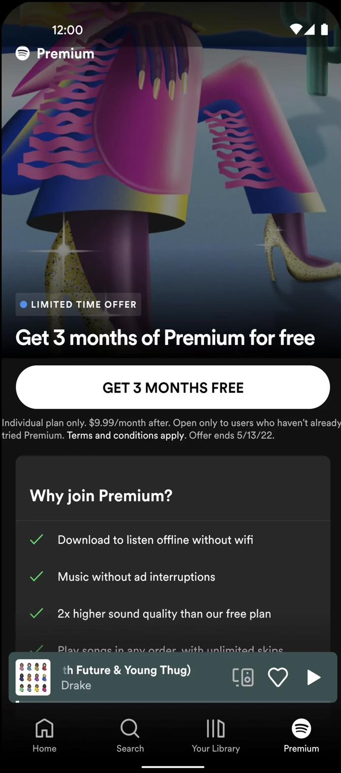
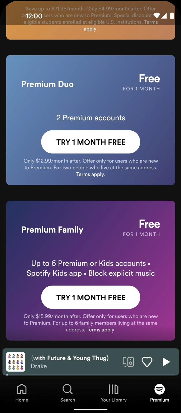
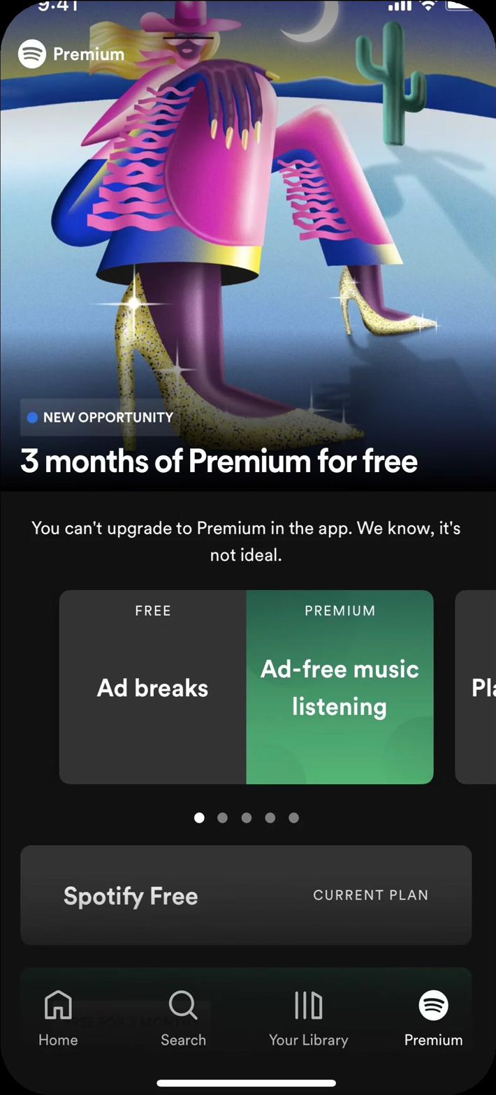
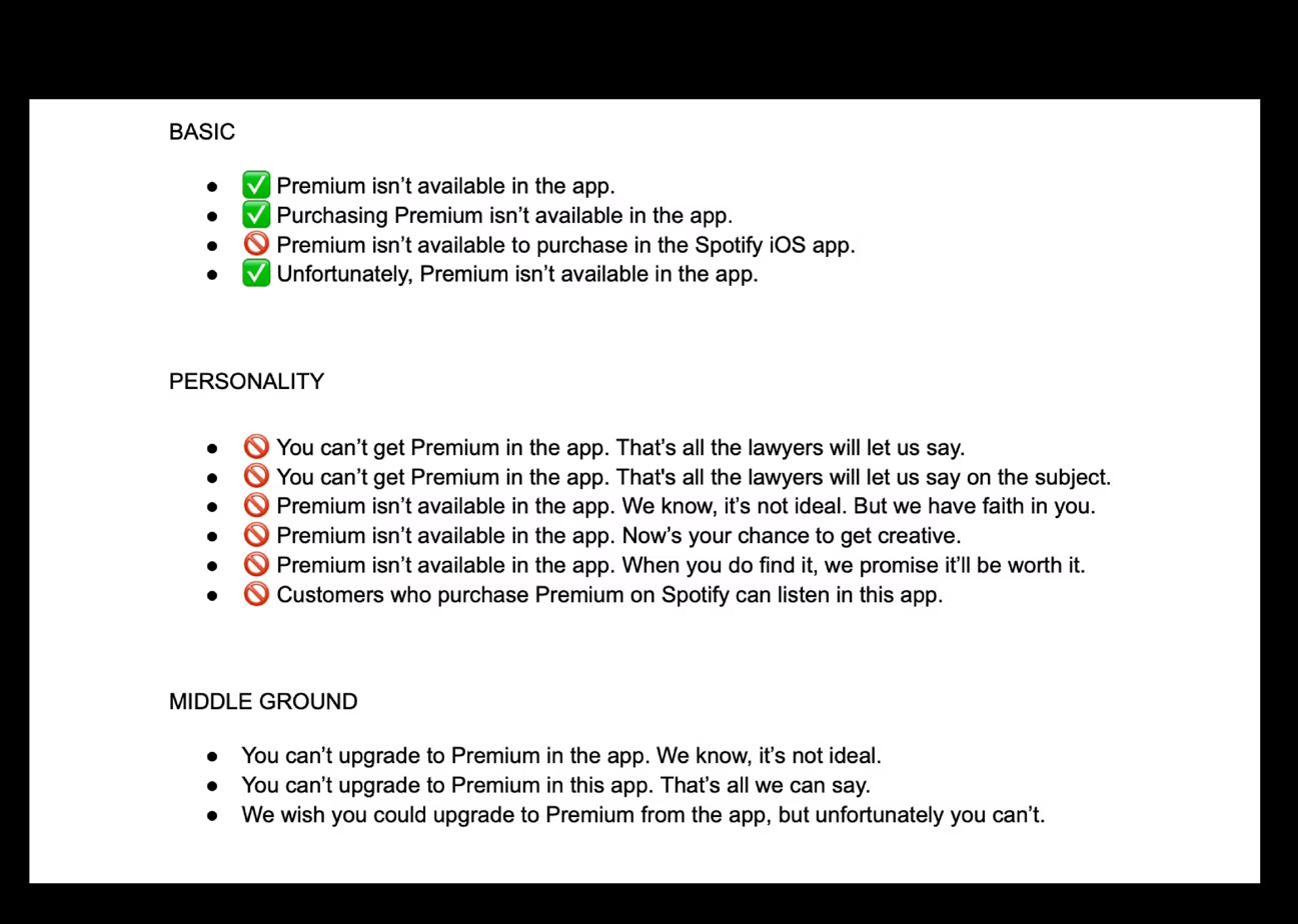
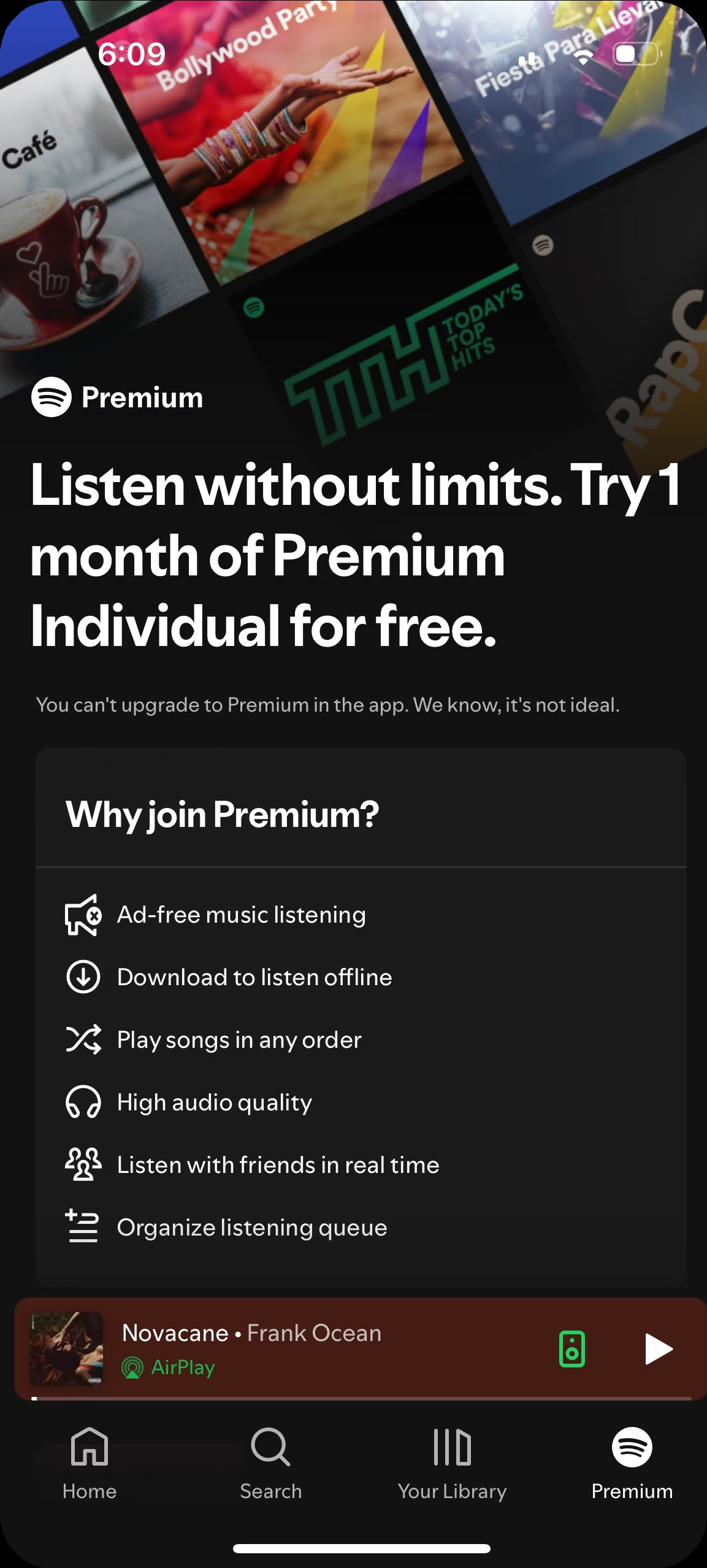
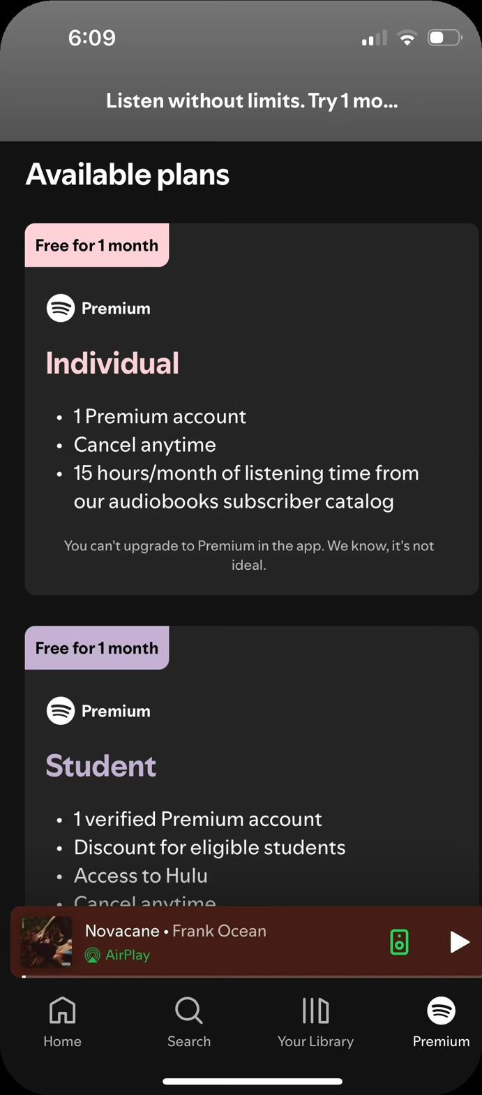
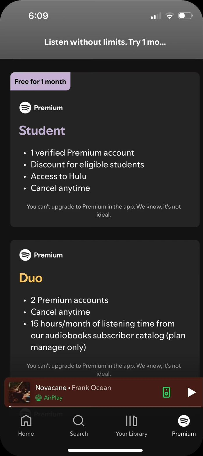
Spotify had recently redesigned the Free experience and launched new Premium plans — Student, Duo, and Family — but none of that information was surfaced inside the Free app. Users had to leave the app entirely to discover what was available, and to purchase a premium plan.

Spotify.com Premium plan comparison page

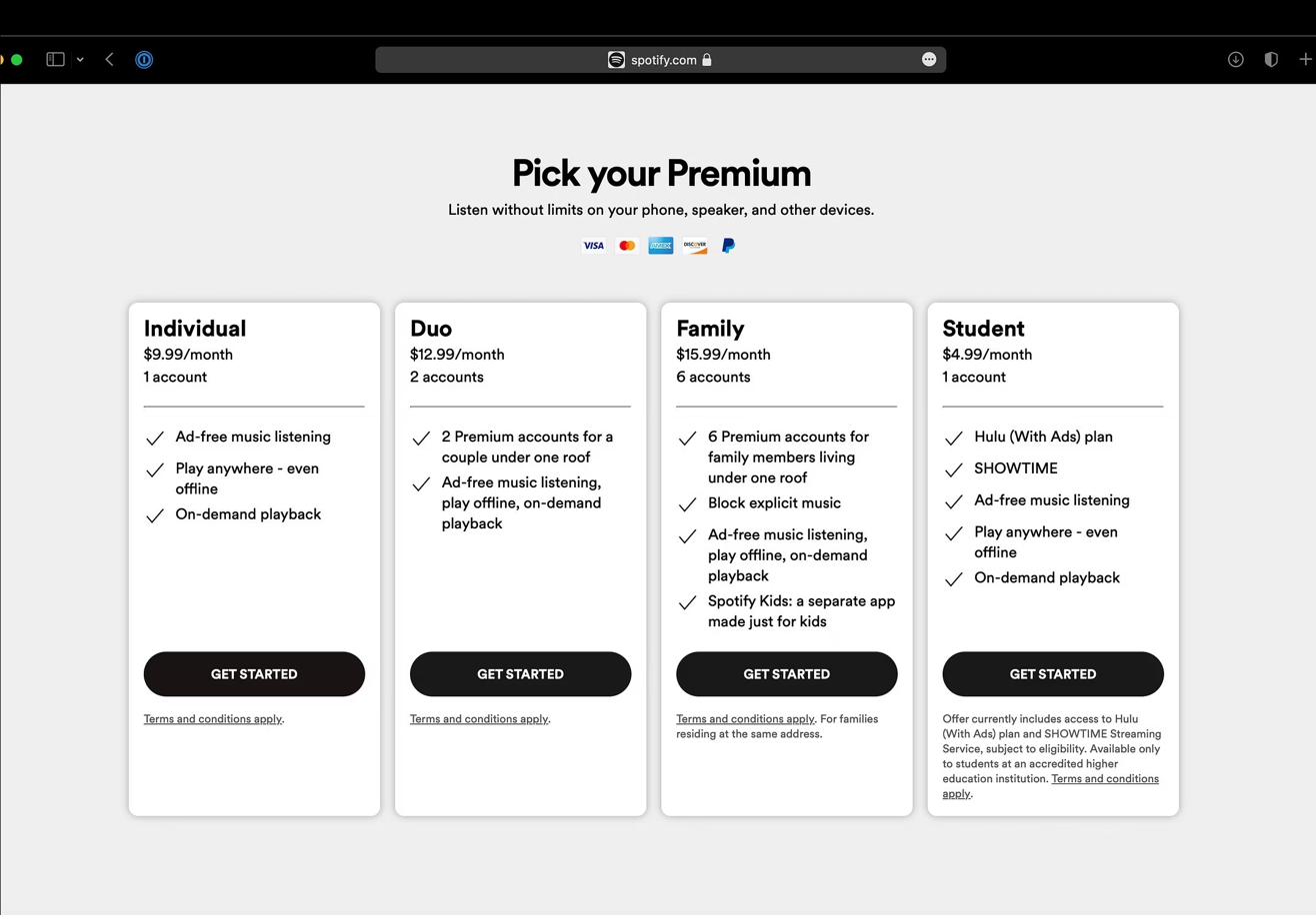
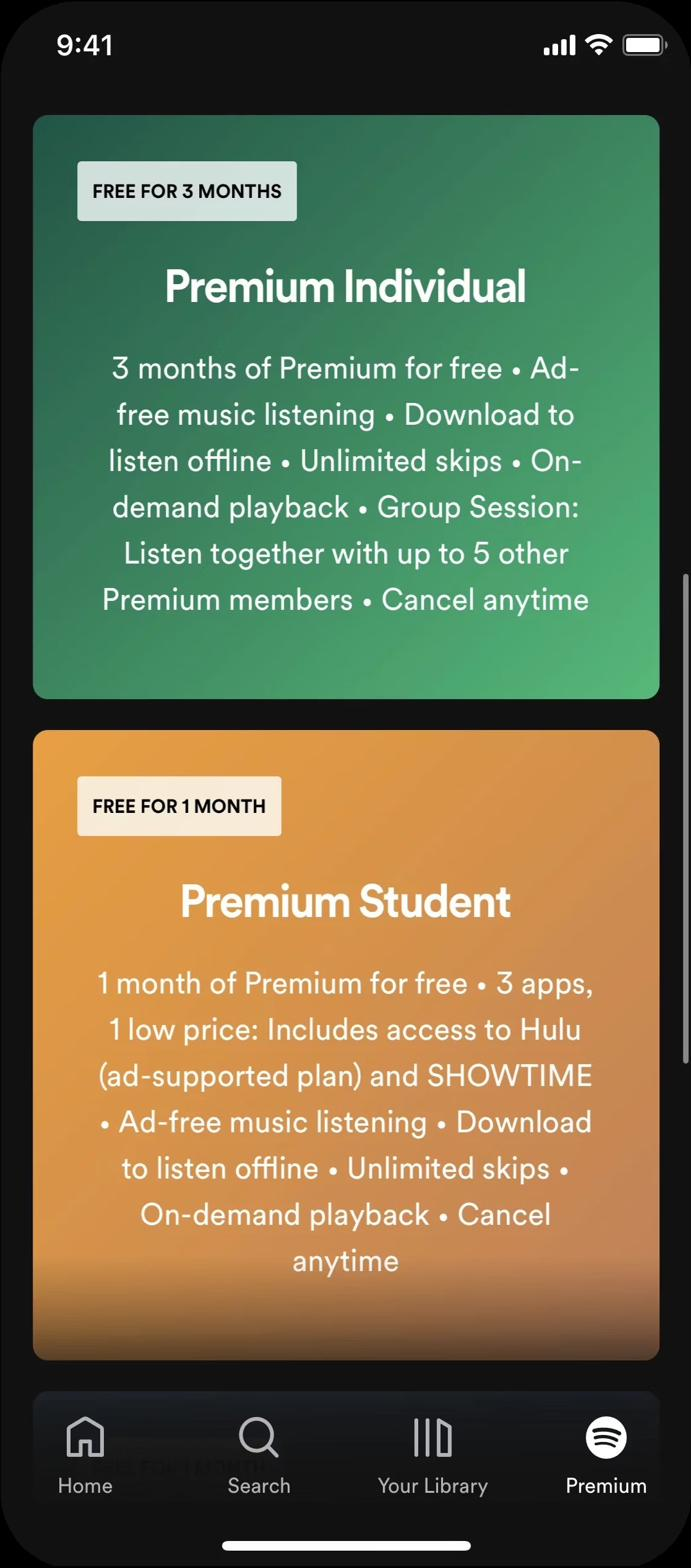
The website made it easy to compare all Premium plans side by side — but none of this existed in the app

02 / The problem

Nobody knew what they were missing

We surveyed 100 Spotify Free users. The numbers were stark:

76%
Unaware of Student, Duo, or Family plans
43%
Unsure how to get Premium
29%
Not interested in Premium

The website made it easy to compare Premium offerings side-by-side. But none of this information existed in the app, where the majority of users spent their time.

03 / The solution

Fighting for a fourth tab in the app

We designed a new Premium page that listed all the plans in one place — a similar experience to the website, helping showcase the variety of plan options available.

This meant adding a fourth tab to the Free experience. Spotify had recently rearchitected the entire app down to three tabs, so proposing a fourth did not come without resistance. But the data was clear: users needed a destination, and the tab bar was the most discoverable place to put it.

04 / The constraint

A tale of two platforms

Apple's in-app purchase system is seamless — but it takes a 30% cut. Spotify, like many companies, chose not to use it. Back then that decision came with a content design cost: Apple wouldn't let you tell users how to upgrade.

Can't hint at leaving the app
Can't mention price
Can't explain how to upgrade

Our Android version included price and CTAs to try Premium — Google wasn't charging commission on digital goods in 2018. But our iOS version had no functionality, no price, and no explanation. It was essentially a static page with moderately helpful info.

This gave us a third goal beyond conversion and awareness: Help Spotify Free users upgrade to Premium on iPhone without telling them how to do it.

Android Premium tab with pricing and CTA
Android: pricing, CTAs, and a clear path to upgrade
Android showing Duo and Family plans with pricing
Android: Duo and Family plans with full pricing
iOS Premium tab with disclaimer, no pricing
iOS: the disclaimer text, no pricing, no upgrade path
iOS plan cards without pricing
iOS: plan cards without pricing or CTAs
05 / The research

Guerrilla research gave us real signal

My product design counterpart and myself ran quick, scrappy user testing in Washington Square Park. We watched iOS users try to upgrade through the new tab. The pattern was consistent: they'd look for functionality in Settings, try Account and Profile, realize the page had no interactive elements, and eventually reach a dead end.

We asked: "What if you saw a line that said you couldn't upgrade in the app?"

Their reply: "I'd think it was dumb, but I'd probably just Google it."

That was the insight. Users didn't need a perfect experience, they needed honesty. If we acknowledged the limitation directly, they'd find their own way.

06 / The craft

Designing the disclaimer

The content design goal was twofold: help people understand they can't upgrade in the app, and acknowledge this isn't a great experience. We explored a range of options across tone and compliance:

Disclaimer copy exploration across Basic, Personality, and Middle Ground approaches
The full disclaimer copy exploration — from basic compliance to personality to middle ground

We landed on three finalists:

You can't upgrade to Premium in the app. We know, it's not ideal.
You can't upgrade to Premium in this app. That's all we can say.
We wish you could upgrade to Premium from the app, but unfortunately you can't.

We placed the chosen line near the top of the page — small font, but impossible to miss.

Then we ran another round of user testing.

17 of 20 iOS users read the disclaimer text and went to the website to complete the upgrade. The other 3 missed the text and used Google or YouTube to figure it out. Every single one found a path.

The best content design isn't always beautiful. Sometimes it's just honest.
07 / The proof

$50 million in year one

The Free team was hyper-focused on retention, so we had to ensure we weren't compromising the Free user base with the new tab. We didn't.

2.4%
Conversion increase
$50M
Revenue in first year
0%
Impact on Free retention

When the Premium tab launched in 2018, Spotify had 56 million Premium subscribers. Today, Spotify has over 293 million — and the tab is still there.

The tab outlived multiple app redesigns over the past 8 years. That's how you know it works.

The Premium tab in 2024 — redesigned but still there

The Premium tab in 2024 — redesigned, updated copy, same disclaimer. Still converting.

Next case study
Managerbot: the AI COO layer
↑ Back to all work
Amanda Lasnik · amandalasnik.com © 2026