Beyond/Taste/The House
Taste · 2024–2025 · Highland Park, LA

Updating a 912 sq ft bungalow from 1908 to meet the moment

The house I bought had a lot of charm. At 116 years old, with under 1,000 square feet, it was cozy and slightly cramped. But I had a vision for what it could be. It had great light, high ceilings, and a layout that made sense. Not all houses have that. But the kitchen was cramped and the 9 foot ceilings sloped down to 7 feet in the back of the house giving it a closed in feeling. It was begging for an update. This is a case study in design conviction.

LocationHighland Park, LA
Original1908 bungalow
ScopeFull kitchen remodel, new story
AdditionExtended downstairs, new primary suite
Full view of the renovated kitchen and living space
Kitchen through to living room — the open plan in full ✦ 2024
01 / The before

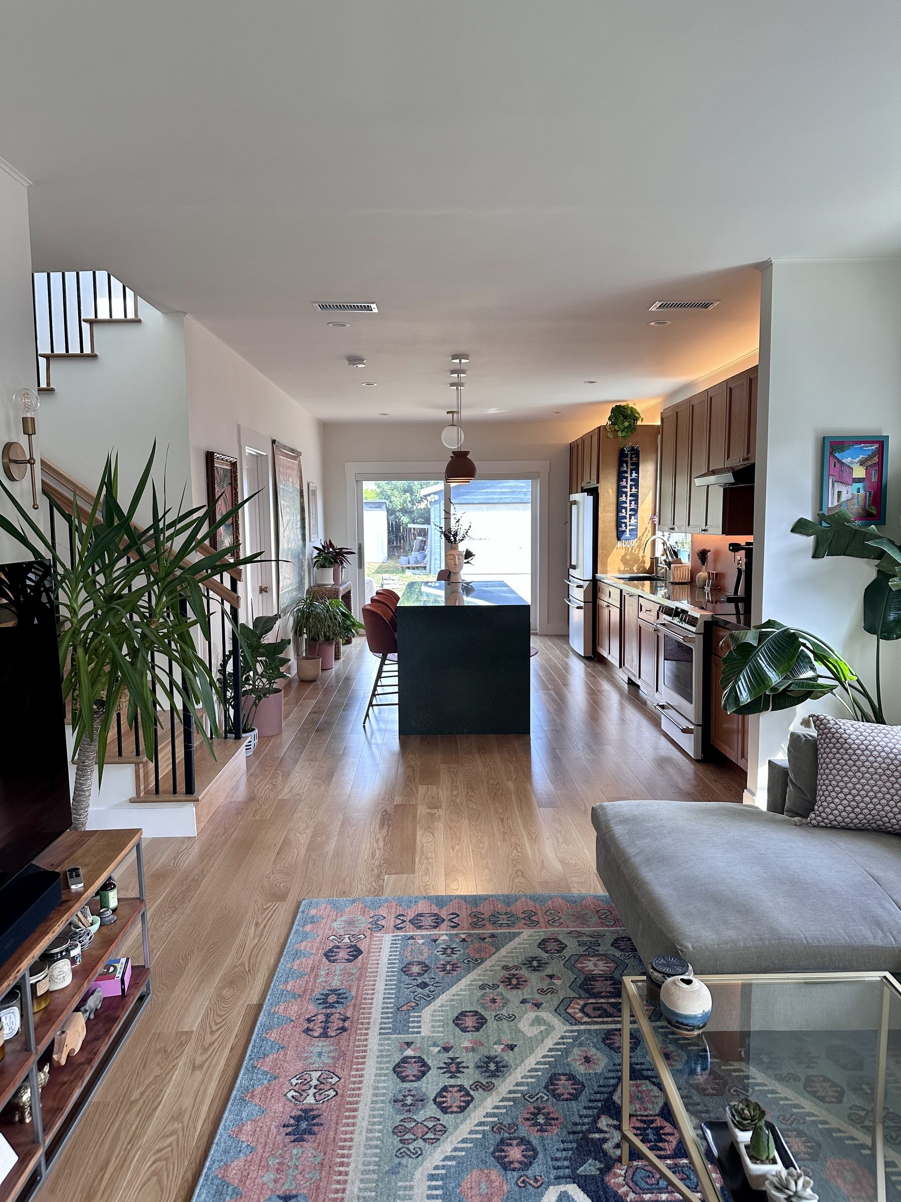
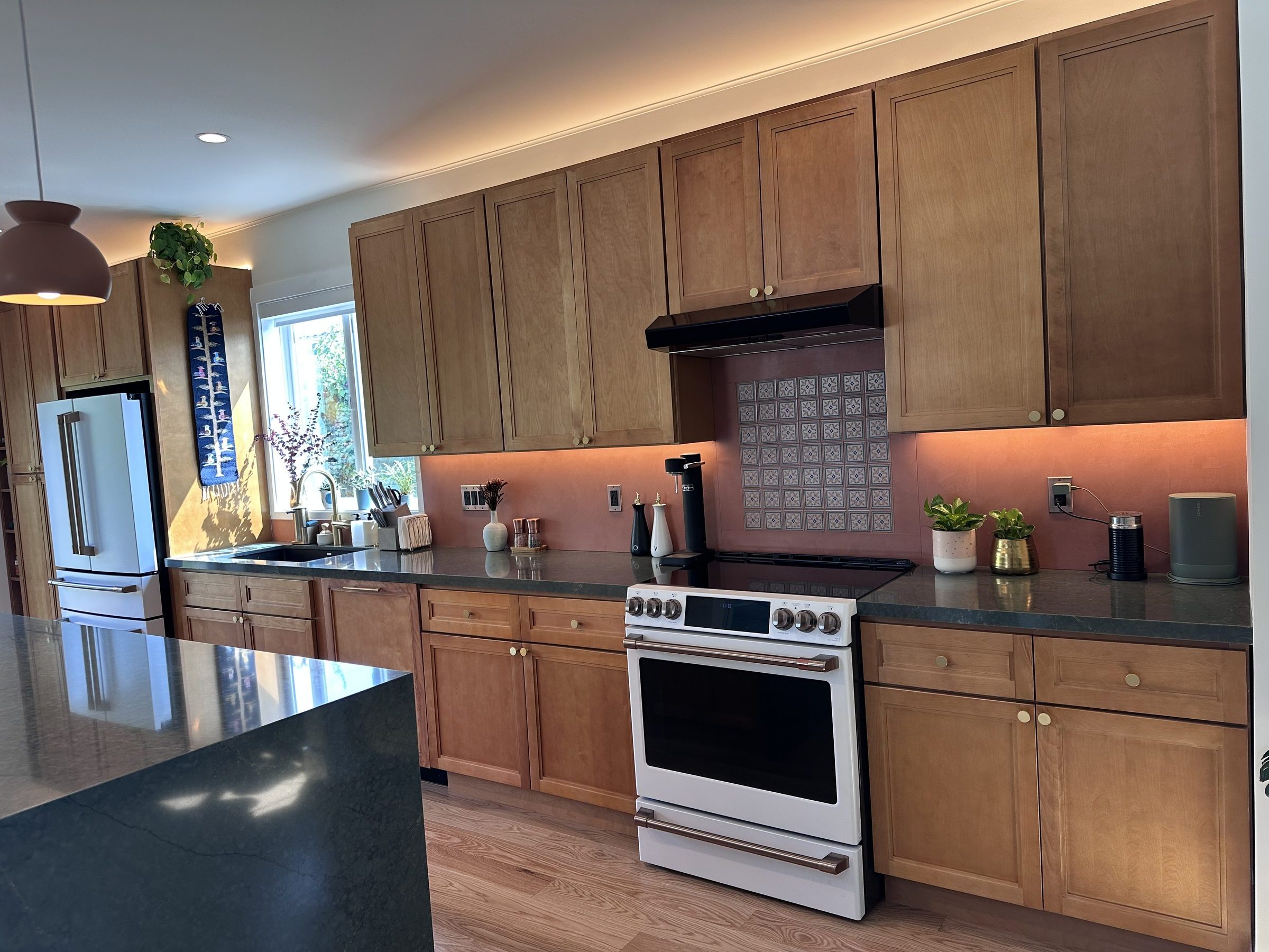
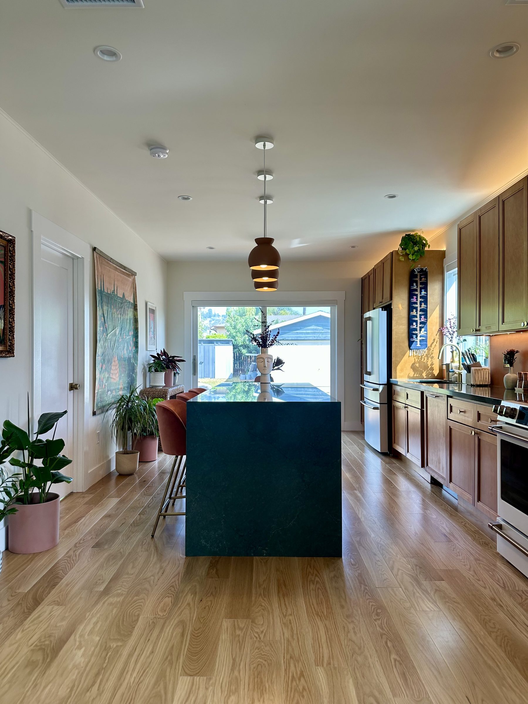
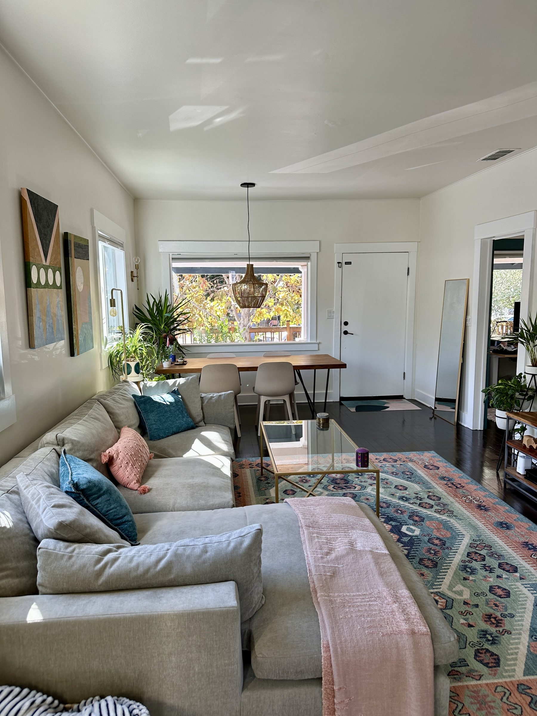
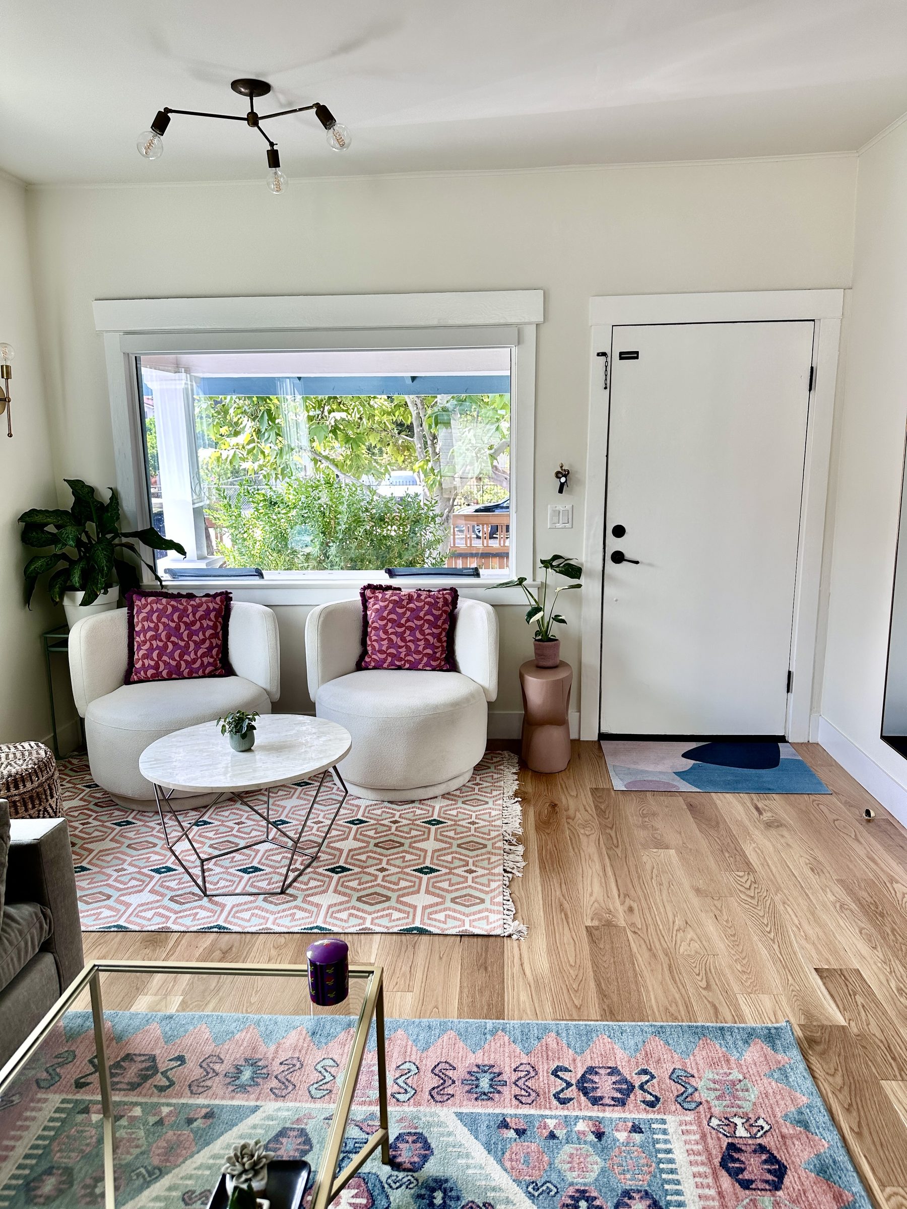
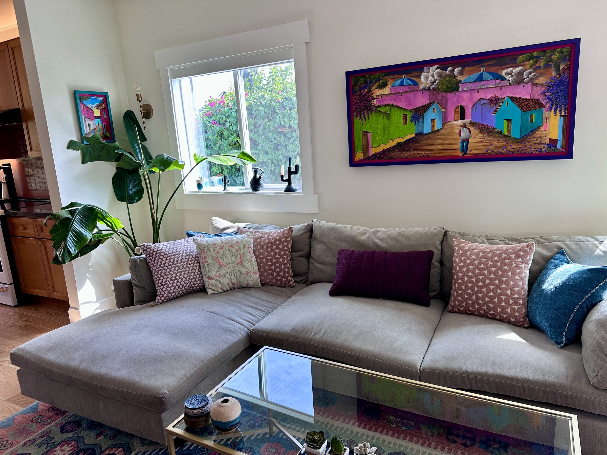
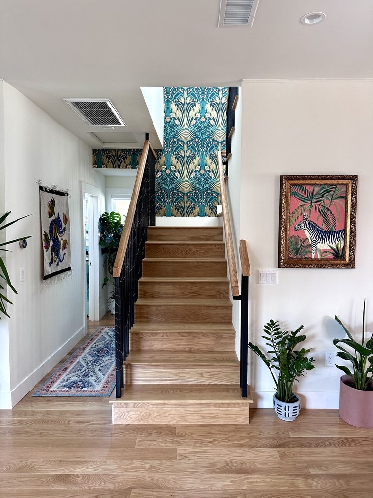
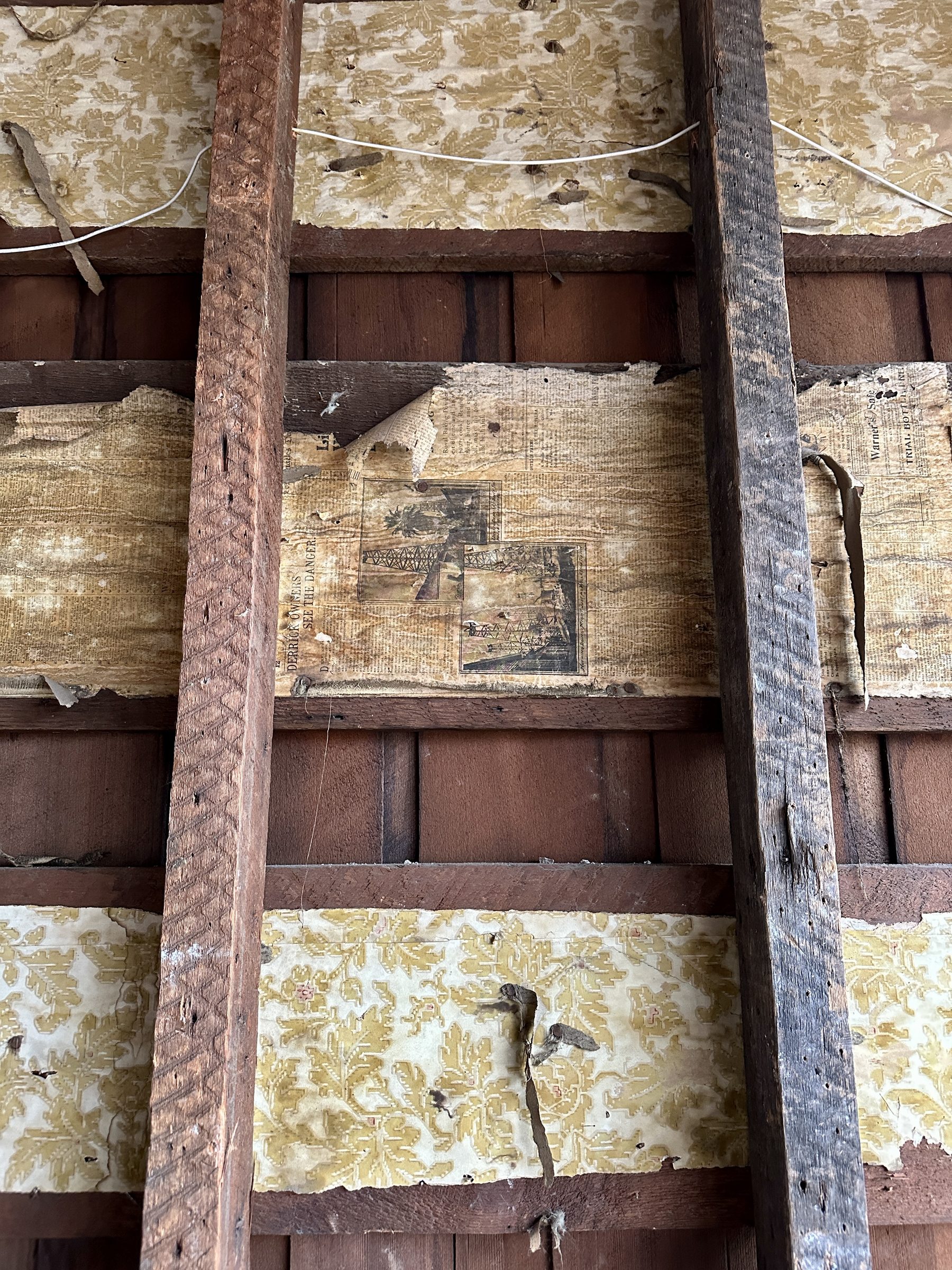
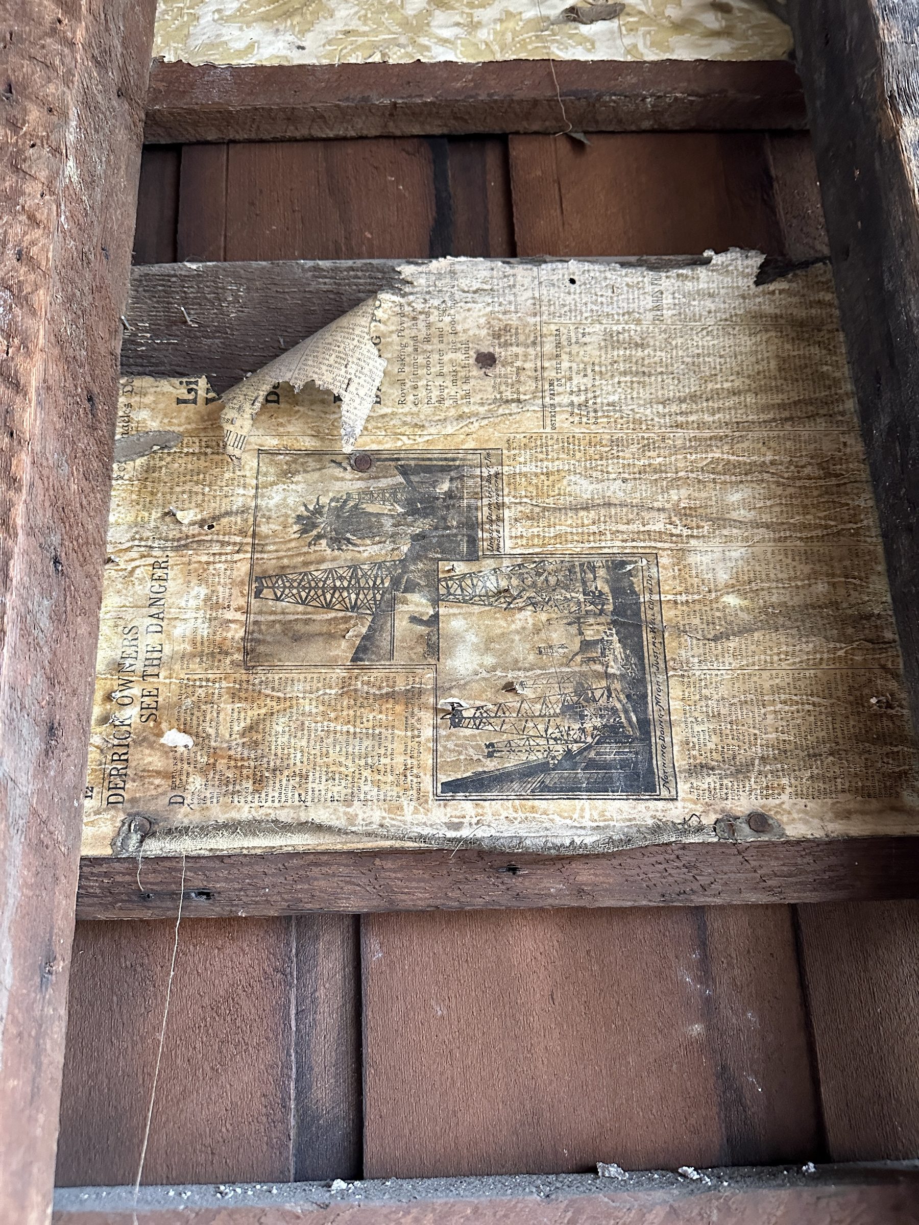
Cute with a lot of potential

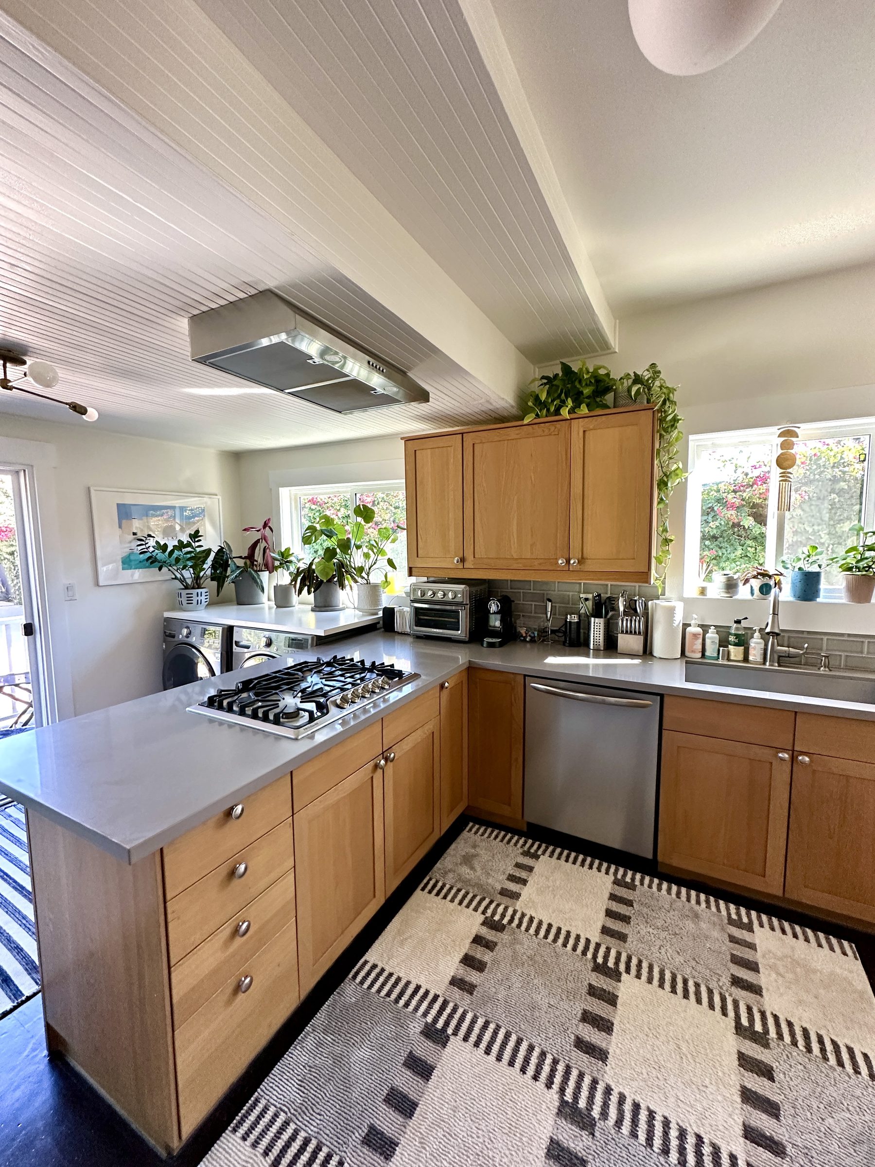
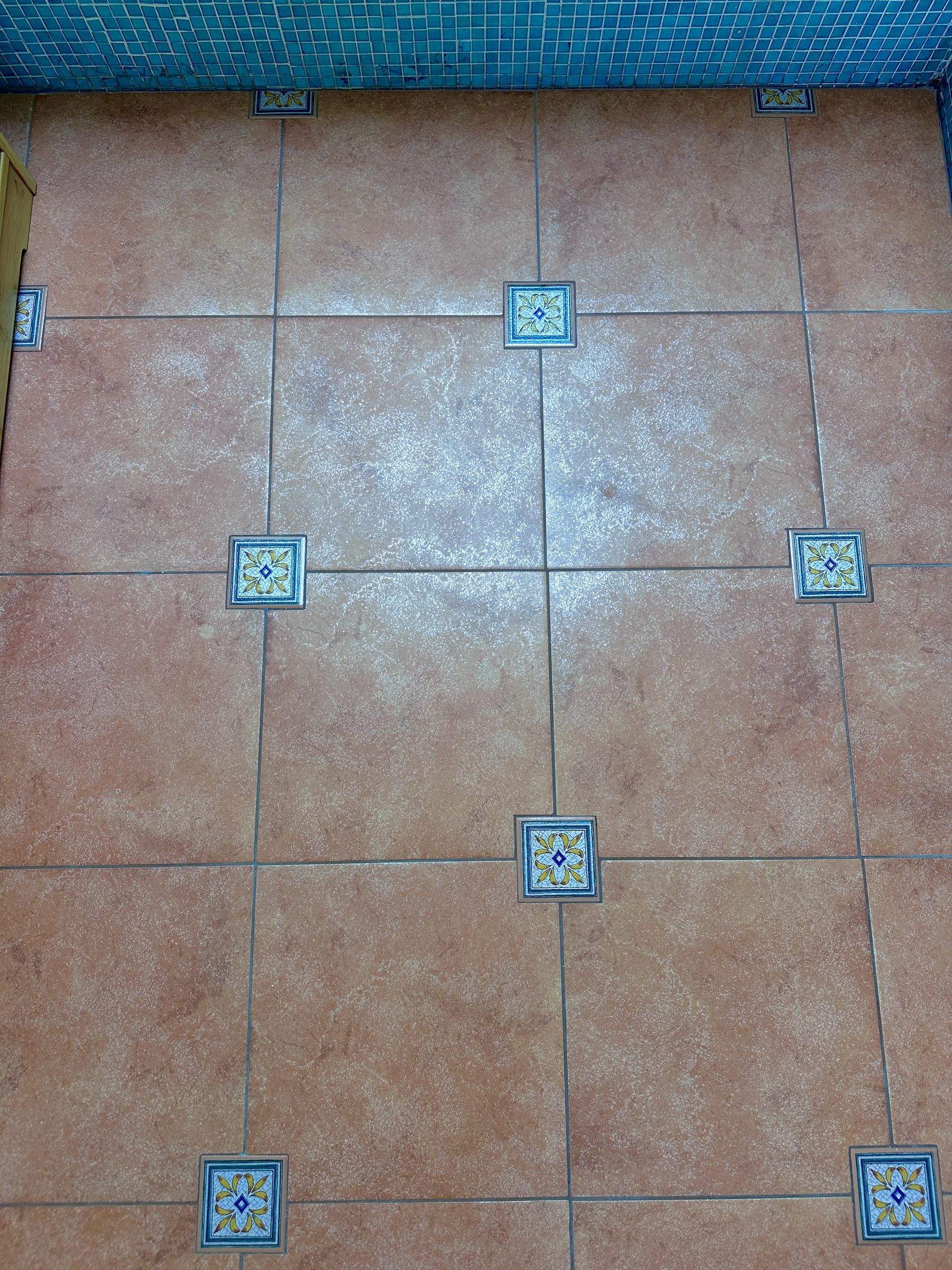
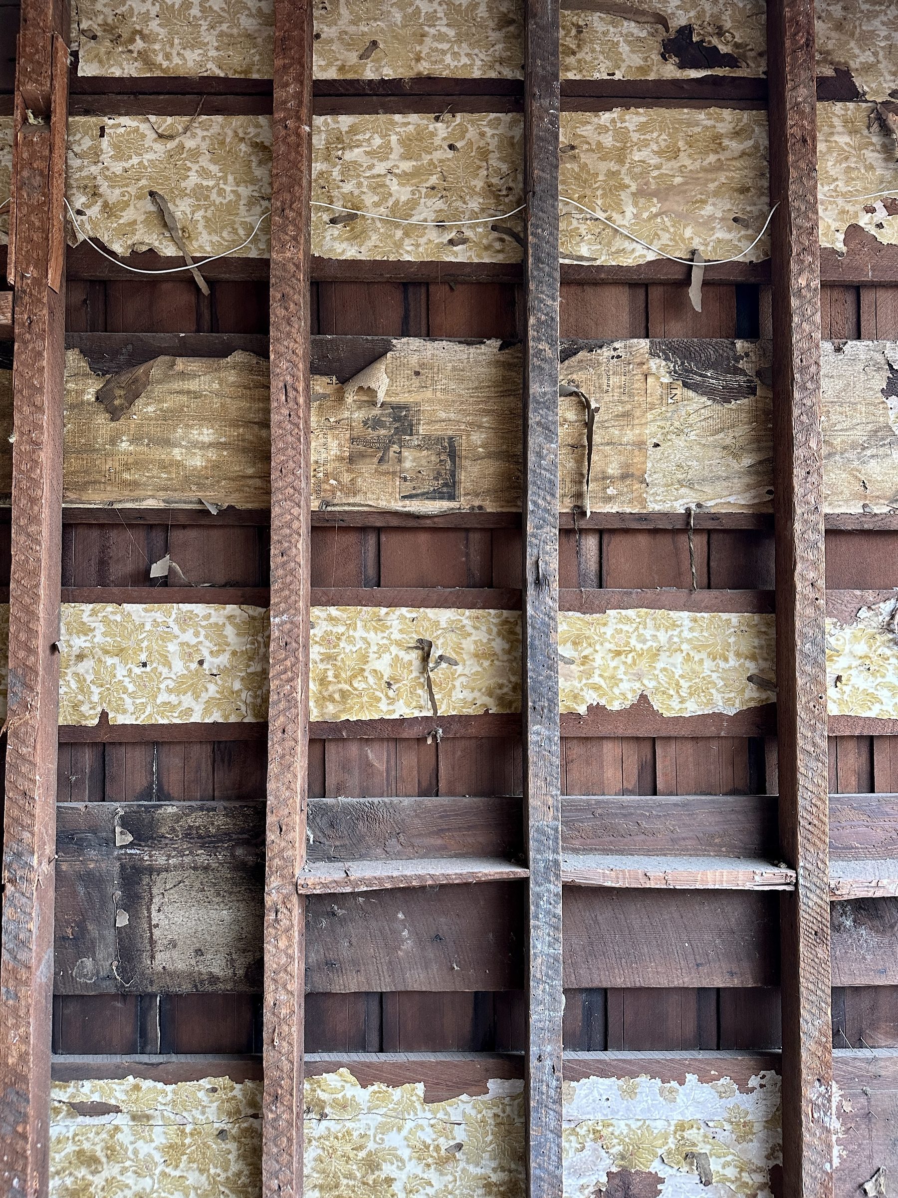
The original bungalow had great bones, a decent layout for the size, but a pretty bad kitchen. The previous owners had modernized the kitchen the best they could, but there was only so much that could be done with the space, the sloping ceiling and the closed-off design.

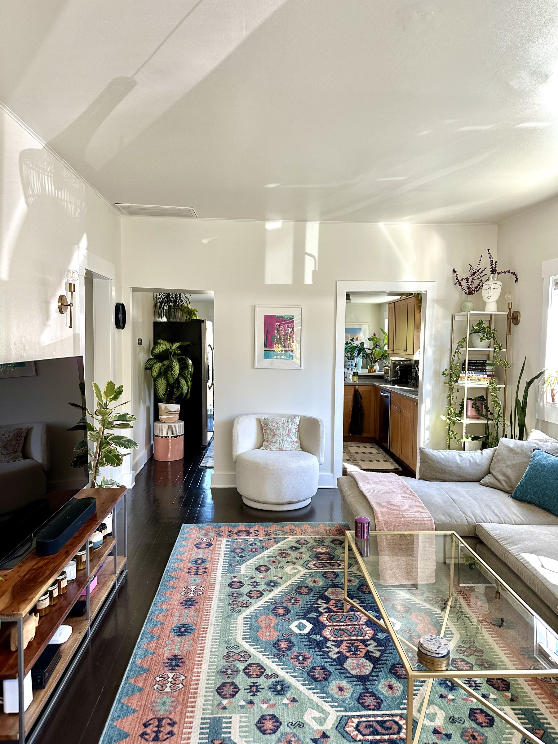
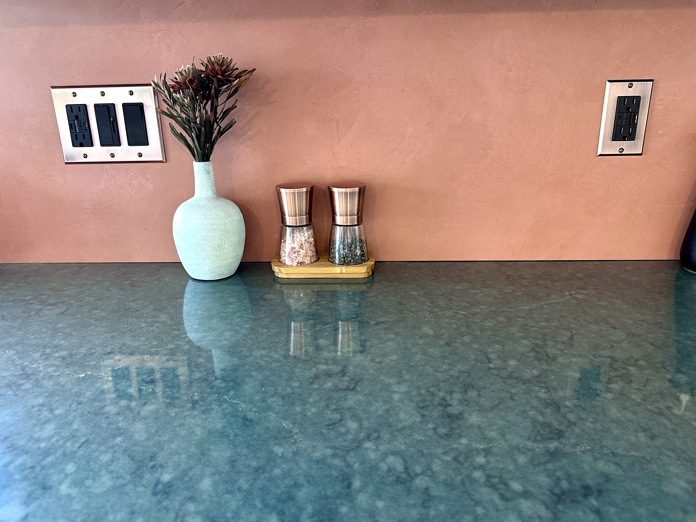
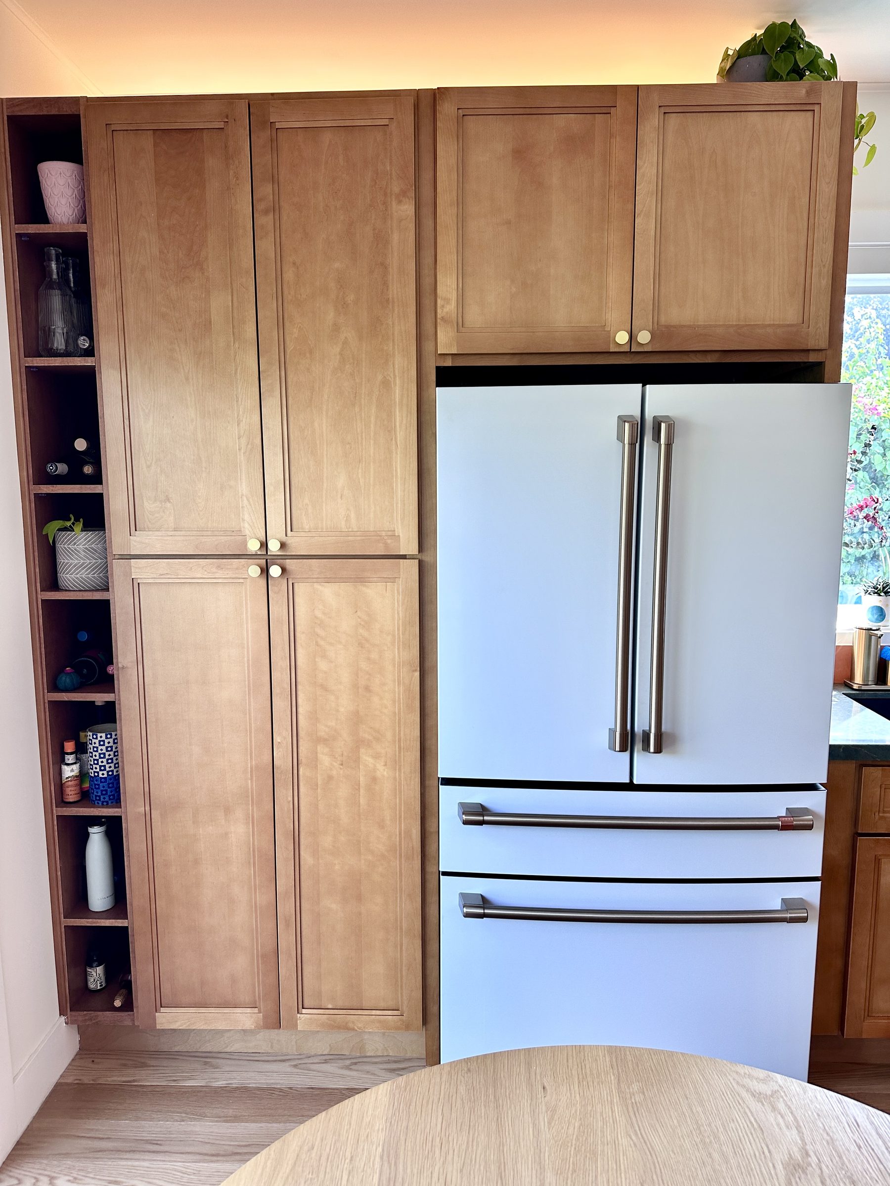
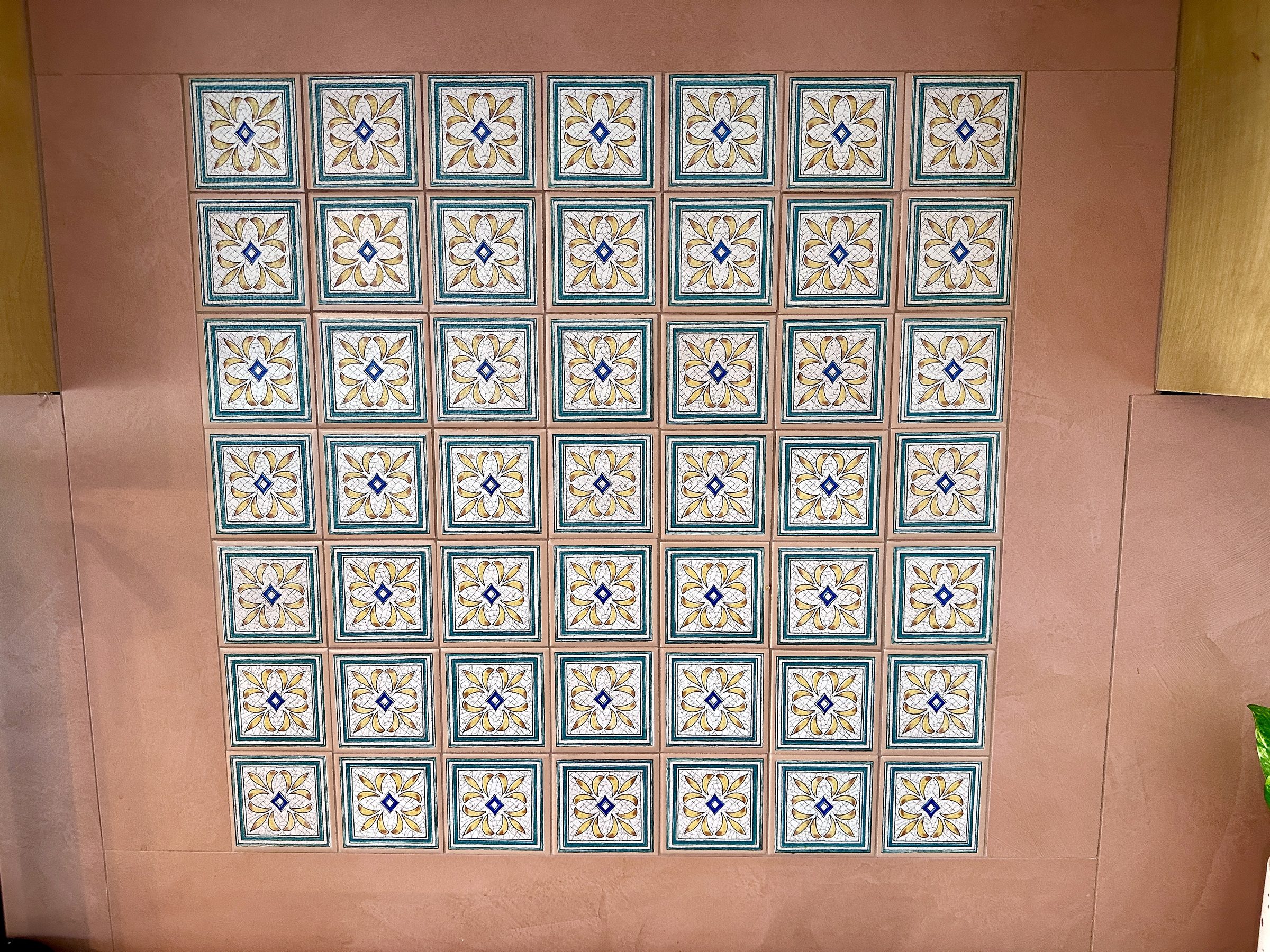
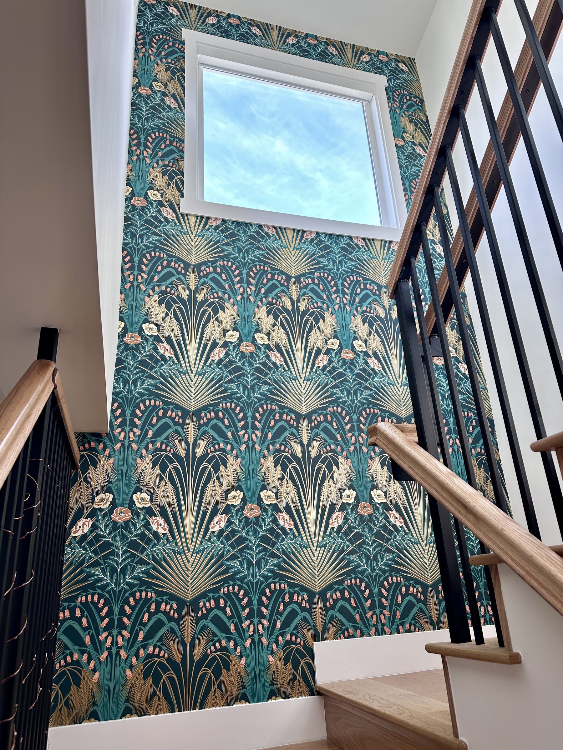
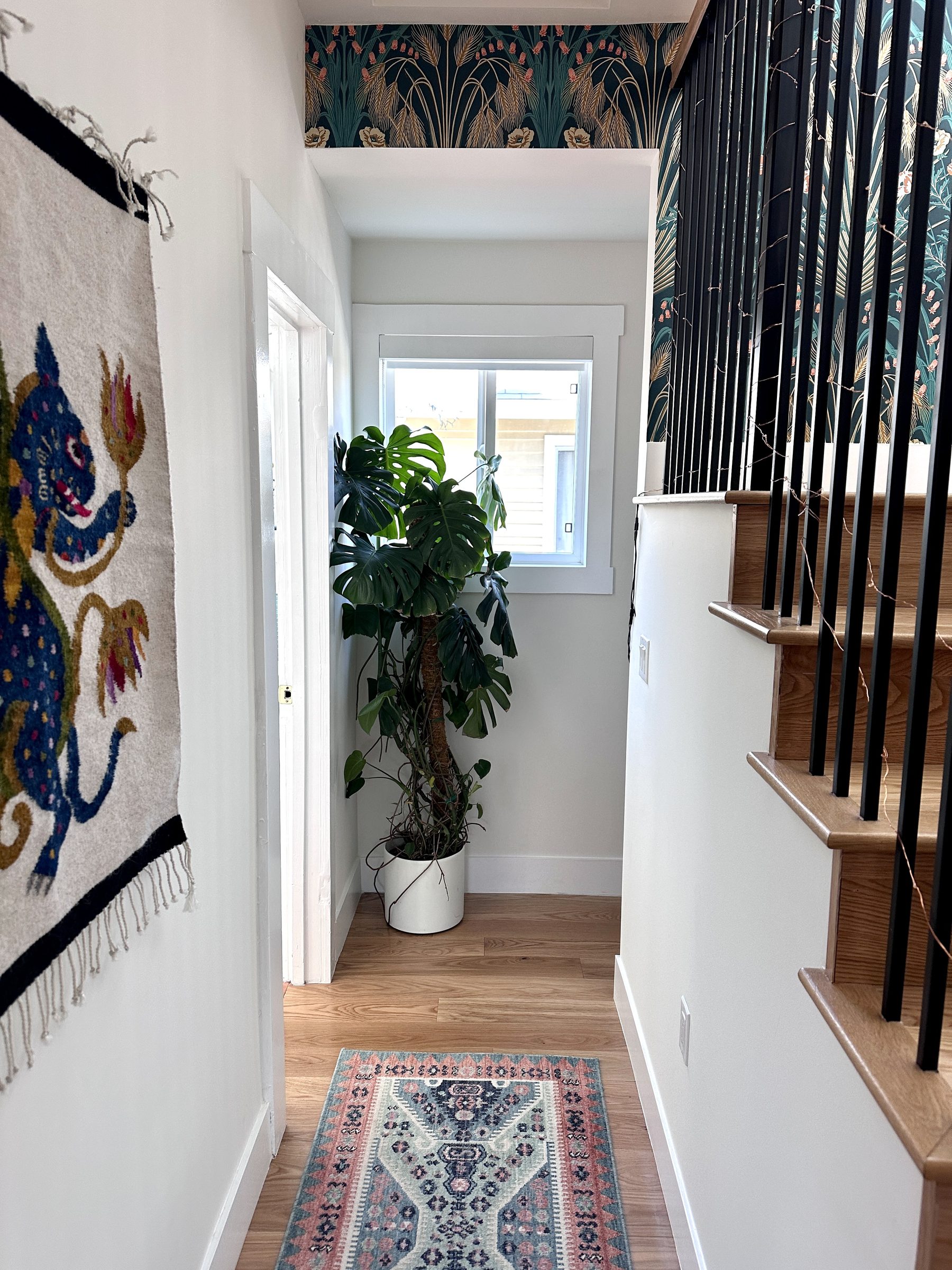
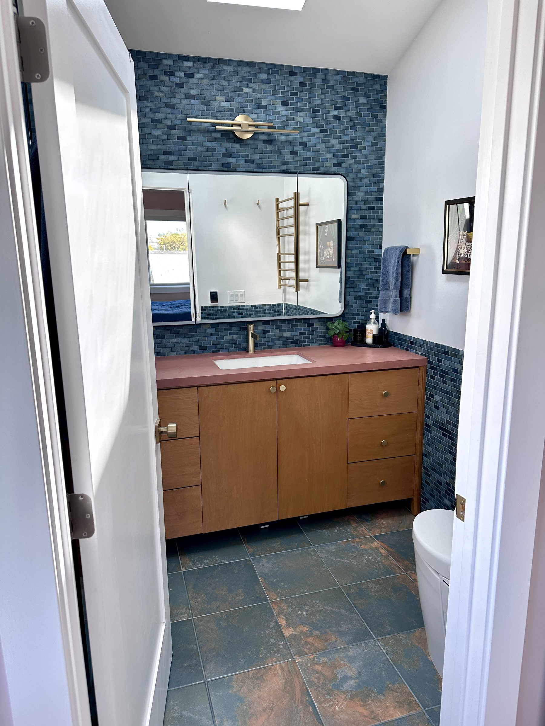
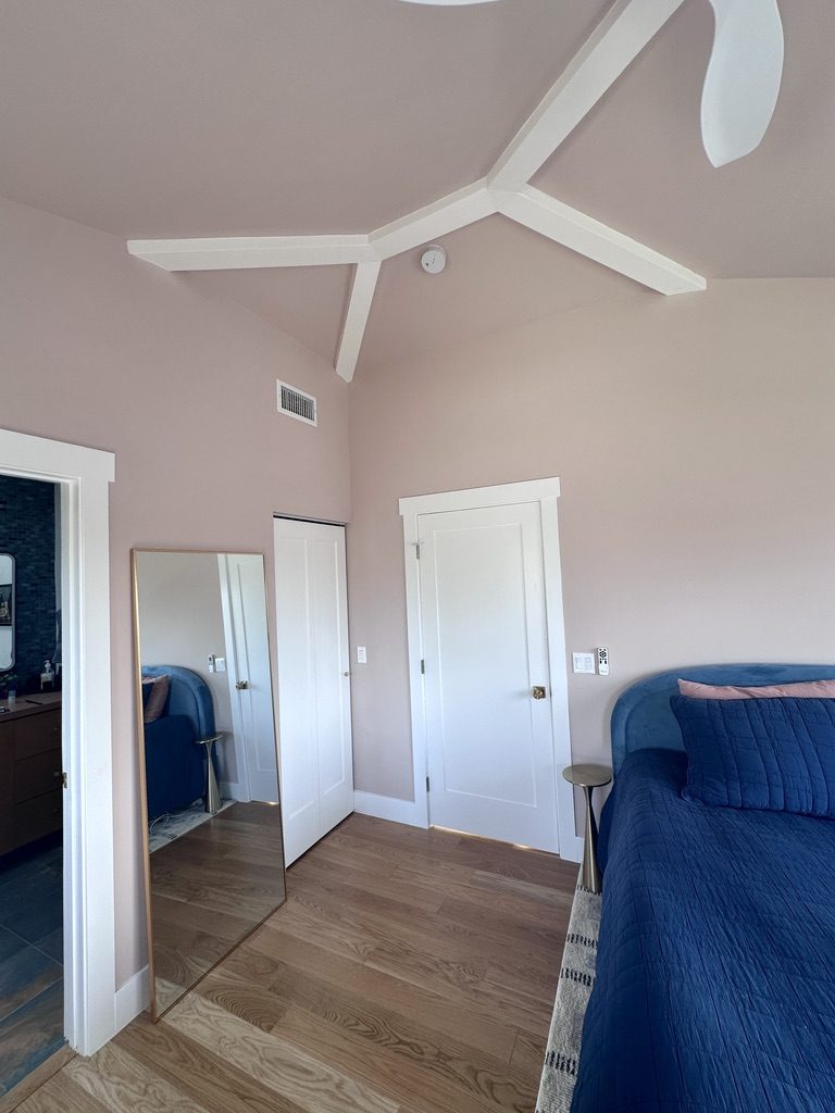
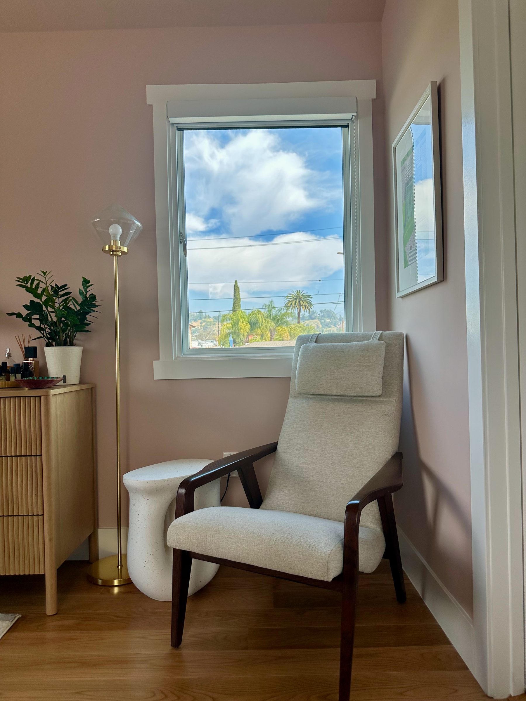
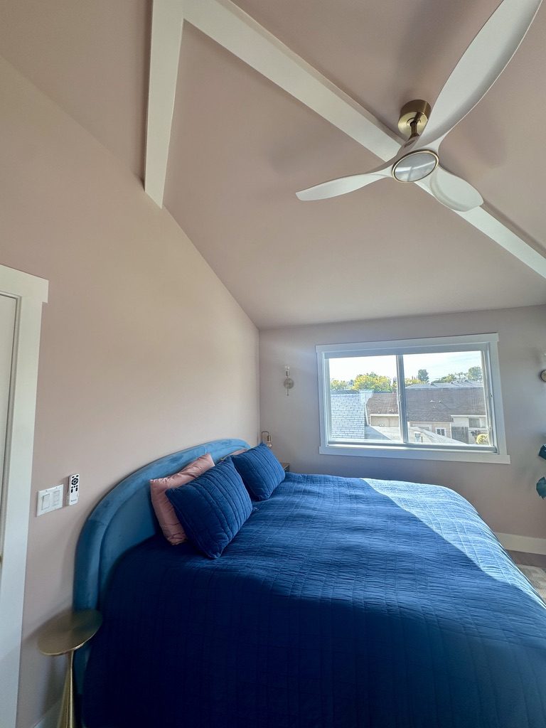
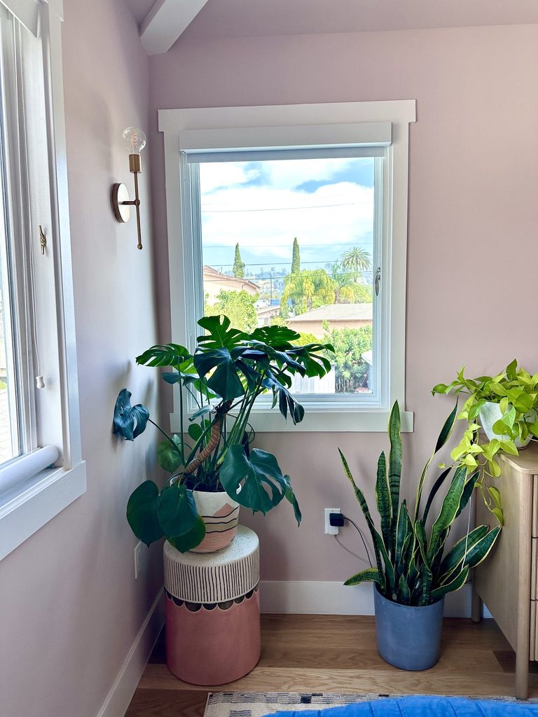
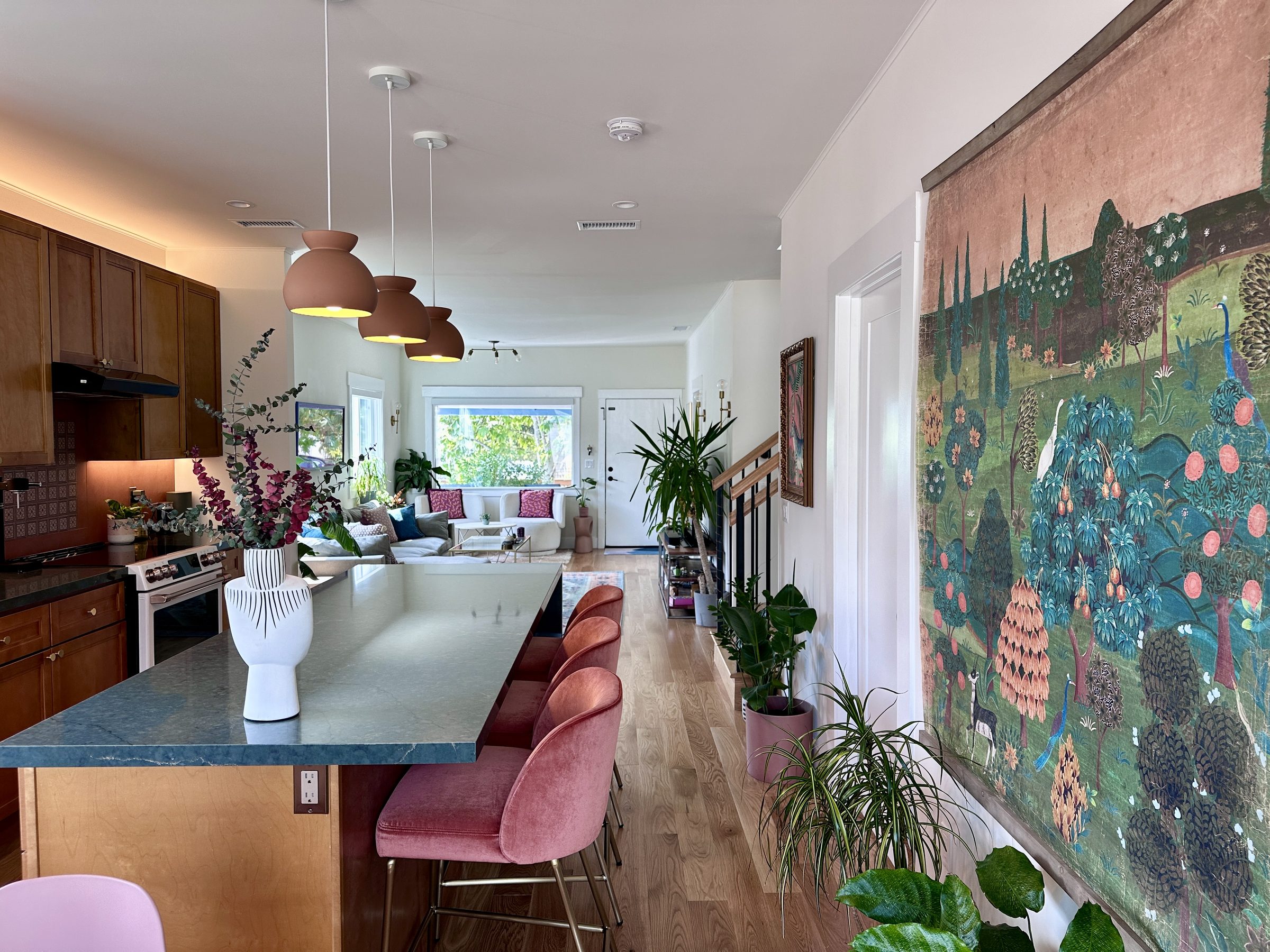
The goal wasn't a flip. It was a home that felt both old and new. One that would reflect the same conviction I bring to product design: every decision intentional, every detail earning its place.

Original galley kitchen with grey counters and dark floors Before
Original living room with dark floors and doorways to kitchen Before
Original kitchen sink area Before
Original narrow hallway with dark floors Before
Original living room looking toward closed-off kitchen with dark floors Before
Same angle after renovation showing open plan through to kitchen and backyard After
Same angle. Same rug. Same console. The wall is gone and so are the dark floors and closed doorways
02 / The vision

Designed with intentionality

I approached this renovation the way I approach any design challenge — by having a vision of where I wanted to go. What should it feel like to walk through the front door? What should the kitchen communicate? How does light move through the space?

The answers became the brief: open, warm, bold, layered. Materials that feel alive. Color that is bold and carries through key surfaces without being overly matchy.

The new kitchen with all appliances and cabinets on one wall
03 / The kitchen

Counters are your centerpiece

Counters are tough. They change the entire vibe of a kitchen. I knew for certain I wasn’t doing white or grey, but how bold did I want to go?

Originally, I found a terracotta matte slab online that I was stuck by. It looked so different from anything I’d seen before that I knew I had to see it in person. When I got to Cosentino, the salesperson showed me a new slab that had just gotten in – a gorgeous deep green slab with gold veins. I hadn’t even considered green but the moment I saw it I knew. I didn’t look at a single other slab. That was it.

Material swatches - Silestone Jardín Emerald, Dekton Umber, and oak side by side
New white oak hardwood floors

To my utter delight, the terracotta looked amazing paired with the Jardín Emerald slab, so I knew I had my backsplash too. I hadn’t been thinking about using a slab as a backsplash, but I knew I wanted to use it as the counter in the new bathroom as well.

The cabinet decision came later. Custom? Prefab? The cost difference can be exorbitant, but you don’t spend that much money to remodel only to cheap out on cabinets. They change the feel of a kitchen. I knew I didn’t want white cabinets (can you sense my disdain for white?).

Ultimately, it was the handpainted tile from Spain that brought the full color palette vision together for me. It has the green of the counter, the terracotta of the backsplash, the gold of the cabinets and the blue of the new bathroom tile.

I had no intention of choosing green counters. But when the materials speak to you, you listen.
Original galley kitchen Before
Renovated kitchen with green quartz island After
Silestone Jardín Emerald countertop against Dekton backsplash
Custom cabinet surround with integrated white Café fridge
Closeup of the Silestone veining and mineral detail
Hand-painted Spanish tile inset in Dekton backsplash
04 / The materials

Every material was chosen through painstaking research

A renovation this small doesn't have room for throwaway choices. Every material had to earn its place — not just look good, but mean something in the context of the whole house. I must've looked at one million counters and ten million tiles. It was that serious.

Because I knew I wanted there to be cohesion without overly matching, there were a few materials I used in multiple places. The hand-painted tiles from Spain appear in both the kitchen backsplash and the downstairs bathroom floor. The terracotta slab that forms the kitchen backsplash reappears as the upstairs bathroom countertop — same slab, different room. Oak cabinetry runs from the kitchen through the upstairs vanity. Three deliberate throughlines connecting every room.

Silestone Jardín Emerald closeup
Silestone Jardín Emerald
Quartz surface · kitchen island + counters
Hand-painted Spanish tile
Ceramic insets · kitchen + downstairs bath
Dekton backsplash
Dekton Umber
Same slab · kitchen backsplash
Terracotta Dekton countertop in bathroom
Dekton Umber
Same slab · upstairs bathroom counter
Teal matte tile shower
Teal matte tile
Vertical stack · upstairs shower
Dark slate floor tile
Blue-green with copper veining · upstairs ensuite
Terracotta floor tile with hand-painted Spanish tile insets
Terracotta floor tile
With Spanish tile insets · downstairs bathroom
05 / The living room

The quiet counterpoint to the kitchen's boldness

The original living room had to make space for a dining room too. It made the entry and the sitting area feel cramped. The dark wood floor wasn't helping either. Now with the kitchen open, the living room extends naturally into the kitchen and dining area. One larger room that invites a natural flow between them.

Original living room with dining table squeezed between sofa and front door Before
Renovated living room with cream swivel chairs and layered rugs After
Sectional sofa with colorful art on the wall
06 / The staircase

Adding a level

The new staircase facilitates the moment you cross from the original bungalow into the new second story addition. It's also directly in the center of the house, so it needed to be beautiful.

Art nouveau botanical wallpaper climbs the full height of the stairwell, wrapping a window that floods the space with light. Oak treads, matte black spindles, and a hand-finished railing. It's a dramatic moment in the house, and it was designed to be.

Staircase from the front with botanical wallpaper, zebra painting, and oak treads
Wallpaper detail looking up the staircase with sky through window
Original dark narrow hallway Before
Renovated hallway with monstera and staircase After
07 / The bathrooms

Color for color's sake

The downstairs bathroom had been recently remodeled. It has a gorgeous turquoise tile, I just wasn't a fan of the beige floors. The old floor was replaced with terracotta tile inset with the same hand-painted Spanish ceramics from the kitchen backsplash. A deliberate throughline connecting two rooms through a shared material language.

Upstairs, the new ensuite is a completely different world. Deep blue subway tile climbs the vanity wall, meeting a Dekton countertop in the same terracotta tone as the kitchen backsplash — the same material, different room, different orientation. The floor is dark slate with copper veining, a stone that shifts between blue-green and warm amber depending on the light. The shower is floor-to-ceiling teal tile in a vertical stack pattern with a built-in bench. Both bathrooms have heated floors — because tile is cold and walking on a warm floor is divine.

Why not have a terracotta bathroom counter? Anything but white.
New downstairs bathroom floor with hand-painted Spanish tile insets Downstairs
Dark slate floor tile in the upstairs ensuite Upstairs
Upstairs bathroom with blue tile, Dekton counter, and birch vanity
Teal tile shower with built-in bench
08 / The addition

A room with a view

The entire second story is new — a primary bedroom with vaulted ceilings, exposed beams, and views of the surrounding hillsides and mountains. An ensuite bathroom. A walk-in closet. All of it sitting on top of a 1908 bungalow that never imagined a second story.

The asymmetrical ceiling in the new bedroom came as an accident. I asked for vaulted ceilings upstairs, but when I saw the framing, I knew immediately I wanted to leave it off center. With the beams running through it, I loved the character it added to the space.

Primary bedroom with vaulted ceiling and exposed beams
Bedroom showing asymmetrical vaulted ceiling and hillside views
Off-center beam structure with closet doors and ensuite entry
Reading corner with mid-century chair, brass lamp, and hillside views
The finished home

The house, complete

Kitchen through to living room
Custom cabinetry with Café fridge
Living room
Living room with art collection
Staircase with botanical wallpaper
Hallway with monstera
Upstairs bathroom
Bedroom with asymmetrical vaulted ceiling
Bedroom corner with hillside views
09 / The conviction

This felt like the physical manifestation of my design career

Renovating a house is the most honest design exercise there is. There\'s no A/B test. No rollback. You live with every decision you make, every day. The green quartz counters, the botanical wallpaper, the open plan that eliminated the option of hiding clutter — all of it required the same thing my best product work requires: conviction.

But I also lived in the space while it was being designed. I got to see the framing, the window height, how the light reflected in the space. And I made changes because of that. I moved windows higher, I changed window sizes, I shifted ceiling designs, all because I saw it as it was being made. This is all similar to how digital design works too.

Where the taste comes in is to instinctually know when something is wrong and something is right. I had so many moments of that during this year long experience.

Original wall framing exposed during renovation showing lath, century-old wallpaper, and newspaper
Closeup of framing with original wallpaper and newspaper clippings from 1902
Newspaper from 1902 found inside the walls during demolition
Inside the walls: original lath, century-old wallpaper, and newspaper from 1902
The gap between knowing what looks good and understanding why it matters — that's the gap worth closing.
Back to
Back to the portfolio
↑ Home
Amanda Lasnik · amandalasnik.com © 2026